
One of the reasons why 2021 will be better than 2020 is that The French Dispatch will be released (on October 22nd, to be precise). For the non-fans, The French Dispatch is the latest effort of Wes Anderson, one of the most appreciated directors around. If you haven’t seen any of his movies, you have to grab Moonrise Kindom or The Aquatic Life of Steve Zissou, and then you can finish the article.
Like many others, I believe one of the reasons I love his movies is his incredible use of photography and color palettes, which can build fairytale plots.

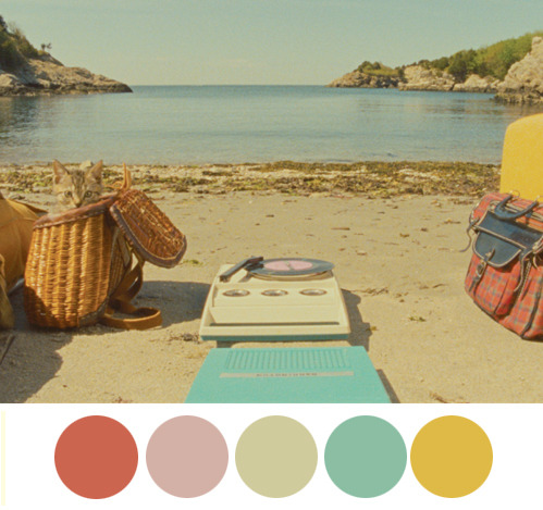
Wouldn’t it be great to be able to style your plots from R studio using those palettes? Thanks to Wes Anderson’s package, you can use these great palettes for your data plots when you use ggplot.
To install it and load it in your project, enter install.packages("wesanderson") and then library("wesanderson") on top of your project. After that, you can create a ggplot2 graph object, choose the Wes Anderson color scheme you want to use, create a palette object, add the graph object and the palette object, and behold your beautiful data.
Specifically, the wes_palette() function requires:
wes_palette(name, n, type = c("discrete", "continuous"))
name: Name of the desired palette. You can find here the list of the available ones.Type: It can be “continuous” or “discrete”.n: Number of colours desired, depending on your chart
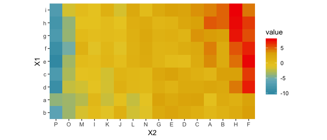
So, let’s say that I defined heatmap my graph and the palette pal <- wes_palette(“Zissou1”, 100, type = “continuous”), to color it as I want, I just need to add the palette element, such as heatmap + scale_fill_gradientn(colours = pal).
Thanks to the following sources
Leave a Reply